Bridgit blog
- All
- Bridgit updates
- DE&I
- Career & team development
- Workforce management insights
- Data strategies
- Bridgit Bench product updates
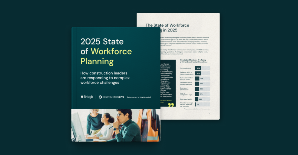
- New workforce planning report details how construction leaders manage labor challenges

- Top construction software trends in 2025
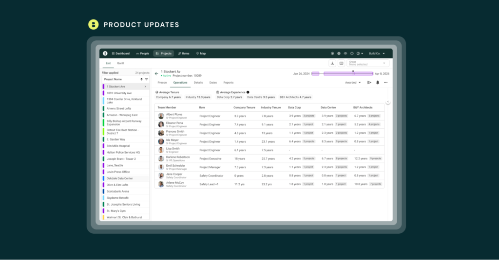
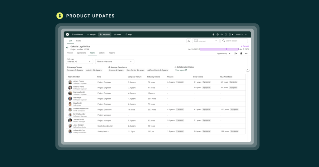
- Build winning teams and stronger proposals: New Bridgit updates
- Ireland’s Largest Construction Projects
- How Contractors Can Comply with UK’s Building Safety Act
- Largest UK Construction Projects
- Bridgit’s Commitment to Workforce Planning Integration Garners Multiple Industry Honors
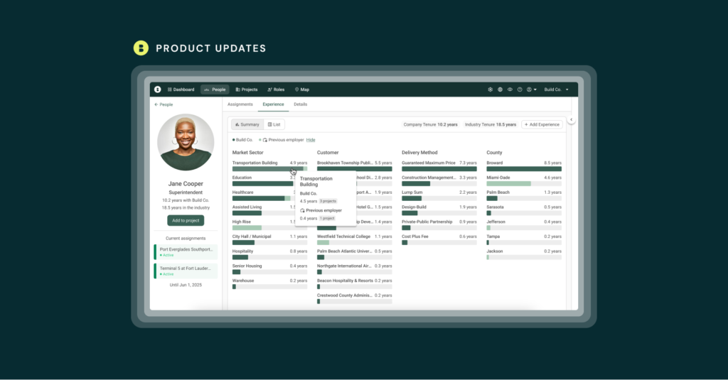
- Reinventing the Internal Resume Database: Bridgit’s Experience Summaries & Other New Features in March
- 5 Ways to Scale Your Contracting Business Without Hiring More People
- Largest Australian Construction Projects
- 5 steps to maximize construction workforce productivity

- Turning Your People Data into a Competitive Advantage: Experience Tracking is Now Live in Bridgit